Logo Redesign: Cortland Breastfeeding Partnership

Role
Designer
Client
Seven Valleys Health Coalition
Tools
Figma, Illustrator
The Brief
Cortland Breastfeeding Partnership was looking to modernize their visual identity while preserving the warmth and inclusivity of their mission. The existing logo felt dated, and the organization wanted a refreshed look that would resonate with today’s diverse audience.
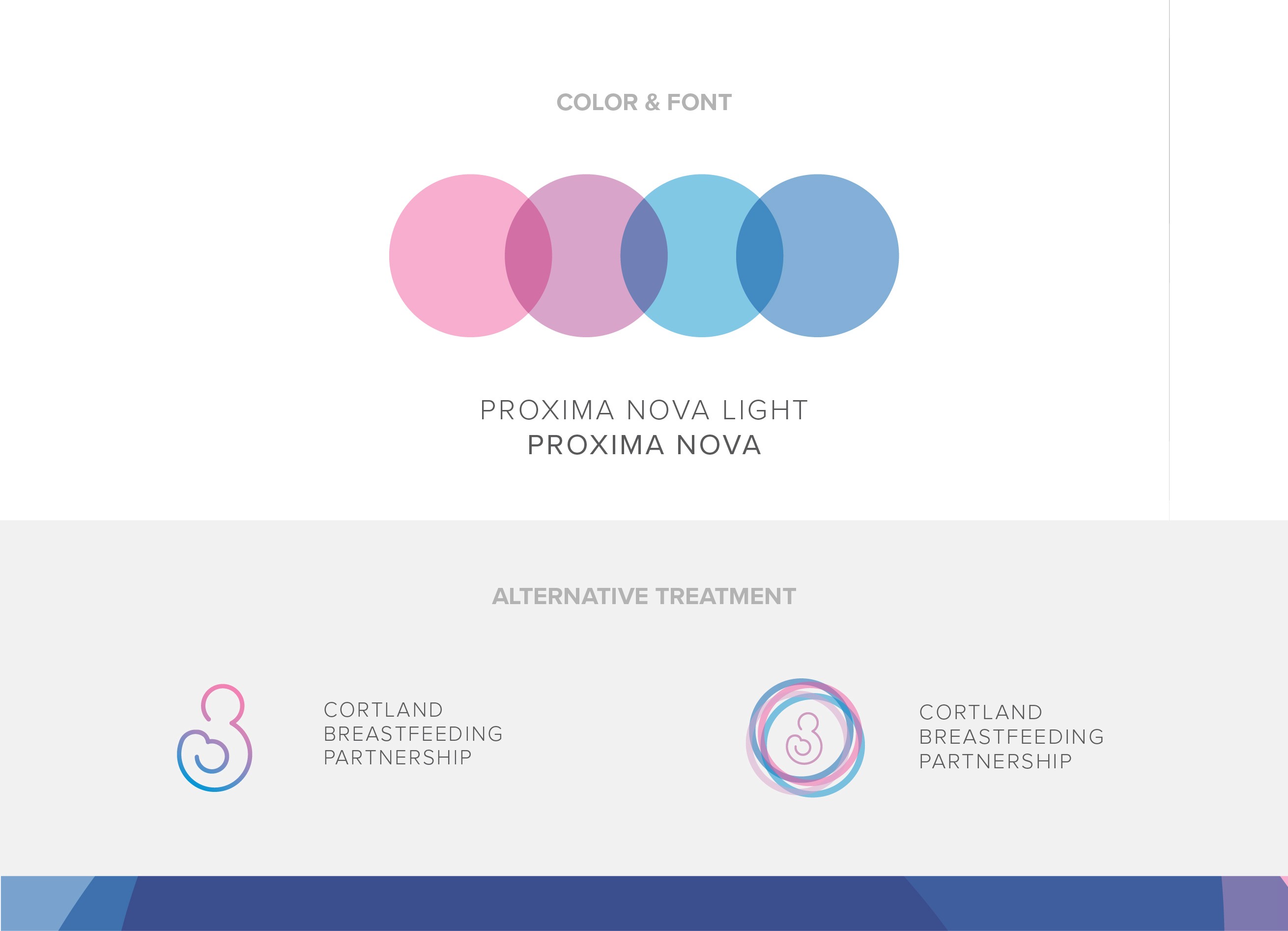
Key Challenge: Achieving the right balance between gender-specific associations with a gender-neutral tone — reflecting the reality that breastfeeding support extends across all family types and caregivers.
The Approach
In redesigning the logo, I focused on creating a simple, modern mark that would feel timeless, approachable, and inclusive. The core shape of the logo subtly evokes the nurturing connection between parent and child — a visual representation of care and closeness.
Color selection played an important role:
I incorporated a soft gradient that transitions between traditionally gendered hues (blue and pink) to underscore inclusivity, while the overall tone remains balanced and neutral. The fluidity of the line work also helps convey a sense of warmth and openness.

The Result
The final logo provides a contemporary and welcoming identity for Cortland Breastfeeding Partnership. It maintains a strong connection to the organization’s values while ensuring that the visual language speaks to a broad and modern audience. The updated mark is now used across digital and print touchpoints to strengthen community presence and brand recognition.